BRAND DEVELOPMENT AND VISUAL STRATEGY
At CASTO, branding goes beyond logos and colors — it’s a strategic story built from the ground up. Each project begins with a deep understanding of the product’s purpose, audience, and unique qualities. We combine technical precision with thoughtful symbolism to create identities that not only look sharp but also resonate emotionally and function flawlessly. From subtle design details to carefully crafted palettes, our branding embodies resilience, refinement, and meaningful connection. Every brand we build tells a story that’s uniquely tailored, performance-driven, and distinctly CASTO.
AQUAPHOBIX
AQUAPHOBIX

Design Process: Where Fire Meets Waterproof
Aquaphobix was born from the fusion of science and storytelling — a name that literally means “fearless of water.” That concept drove every step of our design process.
We began with function: Aquaphobix is about protection, performance, and precision. So the branding had to reflect those qualities — clean, bold, and resilient.
Then came the emotion: Inspired by the untamed duality of nature, we chose a color system rooted in gradient blues (symbolizing clean water, clarity, and innovation) and fiery red corals (representing energy, heat resistance, and strength). This balance mirrors Aquaphobix’s promise: to withstand water and heat with equal confidence.
At the heart of the logo swims the seahorse — a symbol of quiet power, resilience, and ecological beauty. Subtle bubbles and droplets float through the design, giving the sensation of being underwater, yet untouched — protected. Like droplets on a hydrophobic surface, the brand repels the elements with elegance.
Our design process wasn’t just visual — it was tactile, elemental, and intentional. Every detail, from the typography to the texture of our mockups, was tested against the brand’s purpose: to look waterproof, feel untouchable, and radiate cutting-edge environmental intelligence.
This isn’t just a logo — it’s a pressure-tested identity, built for a product that thrives where others fail.
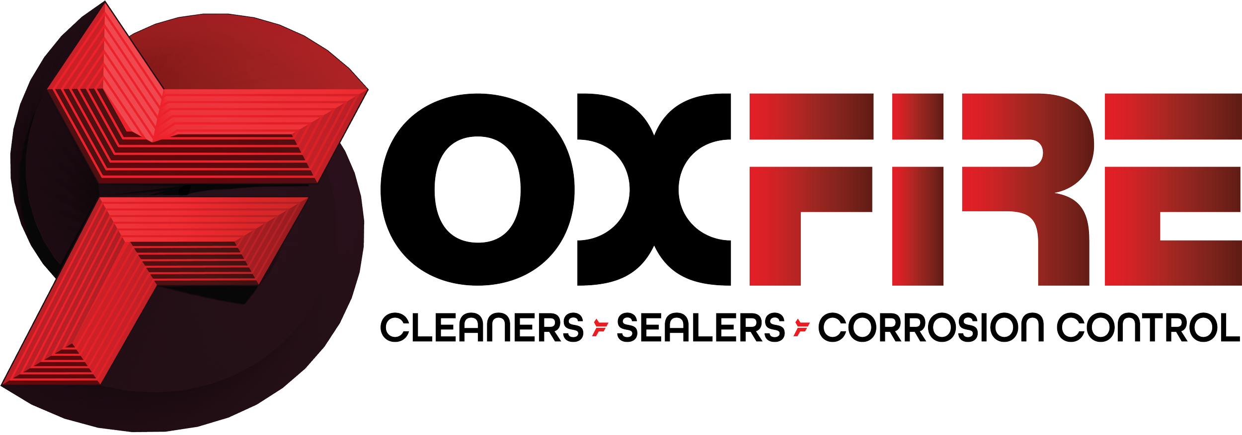
FOXFIRE
FOXFIRE
Design Process: Strength with Subtle Spark
The Foxfire brand was built to convey durability, intelligence, and legacy — a company grounded in technical expertise, but never afraid to stand out.
Our design process started with that same balance. Foxfire lives at the intersection of precision and power — so the brand needed to communicate toughness without losing refinement.
The name itself is bold: Foxfire — evoking agility, quick problem-solving, and a spark of ingenuity. While the logo doesn't shout with imagery, we embedded a subtle tribute: fox ears in the “F”, honoring the original mark and hinting at the cleverness behind every repair.
The color palette carries serious weight — industrial silvers and concrete blues speak to the trustworthiness and technical expertise of the field. Deep reds inject a sense of energy, pride, and quiet patriotism, without veering into cliché. Together, these tones form a confident, capable visual language that feels both grounded and elevated.
Foxfire isn’t about flash — it’s about fortitude. The design reflects that: clean lines, no-nonsense typography, and subtle nods to heritage. It's a brand that shows up ready, stays the course, and leaves things better than it found them.


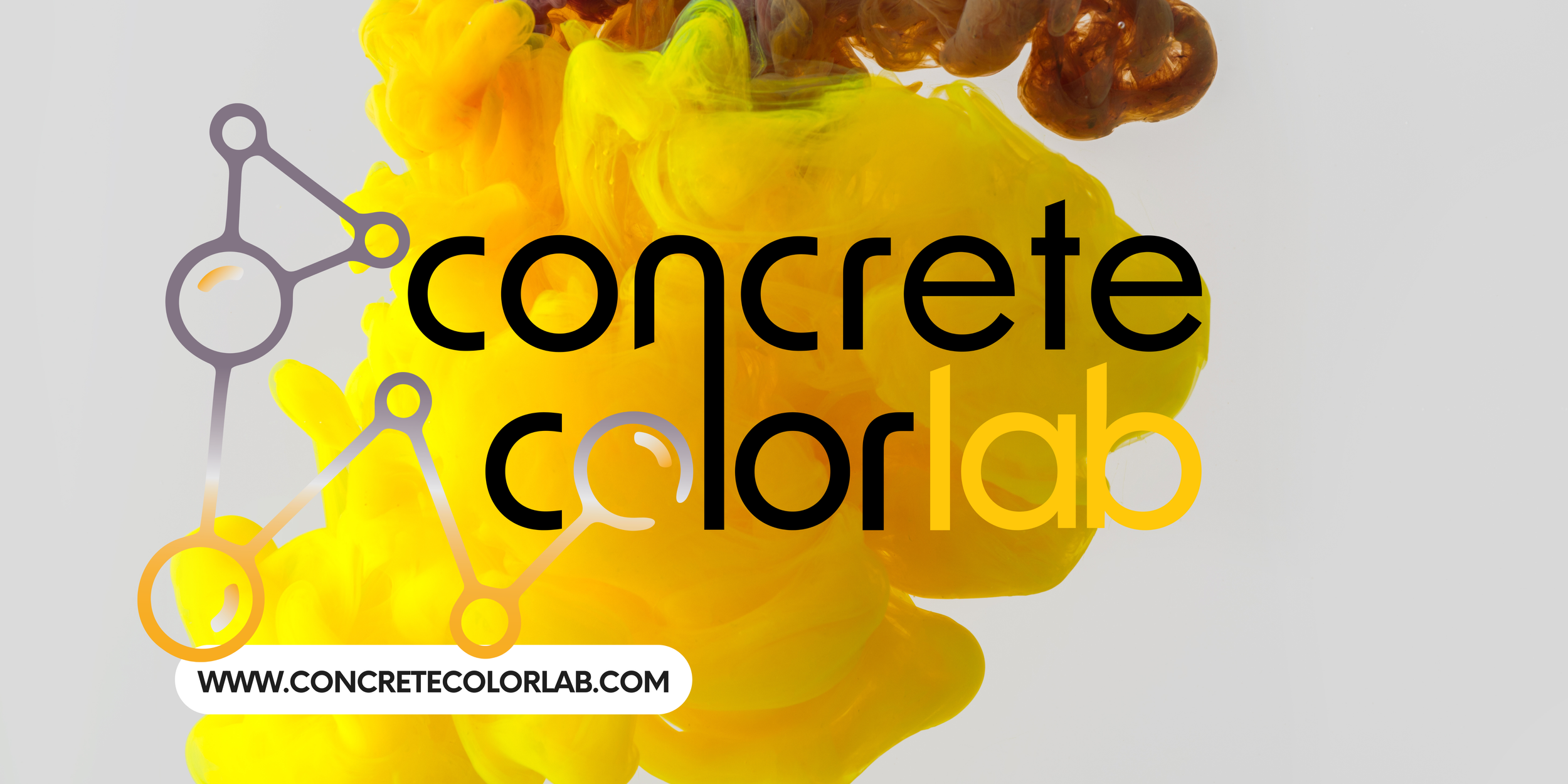
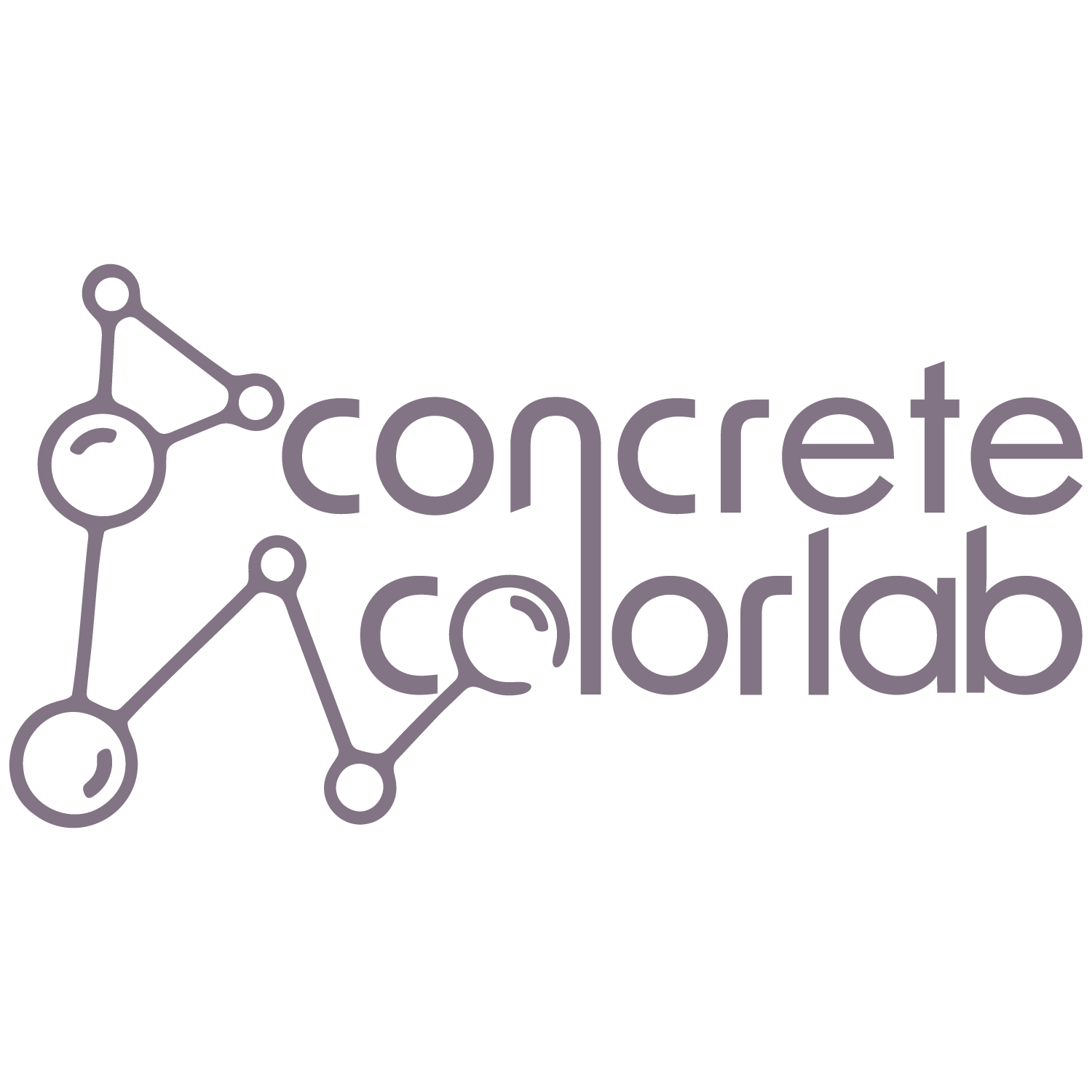
CONCRETE COLORLAB
CONCRETE COLORLAB
Design Process: Chemistry Meets Customization
Concrete Color Lab was designed from the molecule up — a brand rooted in science, precision, and limitless formulation.
The design process began with the core idea: color isn’t random — it’s engineered. Every pigment, reaction, and result is intentional. So the branding had to reflect that same intelligence and intentionality.
The logo draws from molecular diagrams and chemical structures, hinting at the lab-born innovation behind every mix. Its geometry and spacing give a sense of order, control, and repeatable excellence — all while leaving room for creative experimentation.
The color palette is a formula of its own:
• Silver and grey gradients echo the material base — concrete in its raw form.
• Warm orange and yellow tones bring energy, accessibility, and a grounded trust that speaks directly to contractors and installers.
• Subtle purple-grays add a layer of refinement and depth — a nod to the artistry behind surface coloration and the customization that sets the Lab apart.
Every visual element — from the icon to the spacing — is a reflection of the Lab’s mission: to bridge science and surface, and empower professionals with tools they can trust.
This isn’t just branding — it’s a system. Tested, refined, and ready to react.